MUSEUM OF CONTEMPORARY CANADIAN ART RECONCEIVED


          Imagine the Art Gallery as a Trojan horse, moving from site to site around the city, unleashing culture as it moves!  TBD-To Be Destroyed: Responses From a Call For Ideas consists of several parts, one of which is a wall-installation featuring  the results of "a call for architects to destroy existing paradigms about art galleries"(MOCCA). From purely speculative, largely incomprehensible culture-babble to eminently practicable, and clearly articulated, sixty-nine  architects each presents a single page encapsulating their vision for the future. One of the best is one of the simplest : make the gallery more inclusive   by unifying it with its locale. For example, remove the huge  iron fence and  parking lot in front of MOCCA and replace them with a walkway and inviting green space.

Populus

MOCCA, exterior
MOCCA,exterior

Populus, detail.

The Museum of Contemporary Canadian Art is moving from its current site on Queen Street West, so this concept will not be realized there, but it's worth serious consideration whatever form the next incarnation takes.


RBC Peoples'  Choice Award Ceramics


Tonight the annual  RBC Emerging Artist People's Choice Award   will announce the winner of the Ceramic Artist prize at the Gardiner Museum. The winner receives $10,000 from the Royal Bank of Canada.
What purpose does this type of competition serve?  Obviously, it's a high-profile marketing tool for the bank,  while the Museum benefits from higher attendance and more intimacy with the world of high  finance. But Museum curators, collectors and dealers determine the financial worth of any given artwork at any given time.  Are these types of competition intended  to provide hoi polloi gallery goers with the illusion that they are participating meaningfully in the process of validating art, deciding what is art?
I think People's Choice awards in the Visual Arts are fun  but ultimately not a very meaningful way of recognizing  achievement or supporting artists.
Riva Cooper "Viral Series" 2012-2014  ceramic, glaze, decal. Detail
 Work by two of the finalists, Riva Cooper and Zimra Beiner:
Riva Cooper "Viral Series" Detail
Riva Cooper "Viral Series"  Detail


Riva Cooper "Viral Series" 2012-2014  ceramic, glaze, decal. Detail

Zimra Beiner ,"Dark and Still" Glazed earthenware. 2014
Zimra Beiner ,"Dark and Still" Glazed earthenware. 2014


Zimra Beiner ,"Dark and Still" Glazed earthenware. 2014
"Piece by Piece", Clare  Twomey 
Gardiner Museum of Ceramic Art

Piece by Piece, detail
Piece by Piece, detail with Meissen originals displayed on pedestals.


Columbine. Porcelain. Meissen. Germany. Mid 1700's

The Transformation of Kitsch.

  Two thousand white porcelain figurines glimmer  in the darkened  special exhibitions gallery at the Gardiner Museum. A single spotlight highlights the contours of this ankle-high, silent horde casting dramatic shadows. The beam illuminates  a black-clad individual working with molds and slip on a table at the far end of the space, cavernous in relation to these clay replicas of three  eighteenth century Commedia del Arte figures from the Gardiner's permanent collection.
The Meissen originals of Columbine, Harlequin and
are displayed on illuminated pedestals opposite the production table. By  the end of the exhibition there will be three thousand reproductions installed in the gallery. My painter friend, Kim,  said it reminded her of a movie set for an historical drama. I thought of the dioramas  of colonial life which I'd recently seen at the Rijksmuseum, and thought of busy ports, and markets. Others said it looked like a party at Versailles.
  Whatever memories and experiences you bring to this large installation, its effect is startling. The juxtaposition of the originals and the reproductions question  the nature of art, manufacture, labour and "the role of the Museum in authenticating and commodifying art" to quote Brigit, the gallery docent. Ghostly,enchanting, this is a work  that  makes you think.

Brigit, Gardiner Museum Gallerist.

It's trite, but how can you not think about Group of Seven at this time of year?


The Redpath Sugar Refinery

The Redpath Sugar Refinery first inspired me to paint.   I saw it first on a school field trip when I was about eight. I believe we took a tour.  I went back to school and painted it from memory, on fire,  engulfed in vermilion flames, imagining the smell of the burning sugar. I put in  a lady sticking her head out of the the long, grey  chute, screaming for help. Her eyes were  green and her hair was long and blond.  Even at the time, I wondered how the lady got into the chute, but never mind-artistic license.  From the top of the silo a worker in  blue overalls plunged to his death!  My second grade teacher, Mrs. Harper, was so impressed she sent the masterpiece off to an exhibition. I never saw the painting again but I have dreamt of this building since and whenever I see it I think of my painting; the bright red flames, the steely grey chute, the  massive silos and the  screaming lady.


Colour Me Badd. Julia Dault at the PowerPlant.


Powerplant  Gallery Staff
I went  to the PowerPlant on Tuesday to look  at the exhibition, Colour Me Badd  by Julia Dault. I was prepared to dislike her work but despite my prejudice, I  admired  her paintings. She uses unconventional, frequently downmarket, materials to create abstract works that  simultaneously look   mechanical and hand made. For example, Starburst , where she uses a  comb rather than a brush .  A pattern of  pale blue vertical lines , about eight inches high and just over an inch wide high  wide descend rhythmically across the surface. Each one has a dark blue drop shadow creating a three-dimensional illusion that makes them appear to float. over  another layer of regular diagonal marks which sweep from edge to edge of the canvas. Chevrons emerge at four intervals on the sides.  A wavy line curves in and through these layered grids, gently contrasting with the strict linearity of the overall design. Blue predominates; cobalt, ultramarine, cerulean, shot with yellow-orange, violet, and fuchsia.
Power Plant Gallery Staff.
 Justin
The method looks impersonal  but homemade, as though a child laboured very carefully to  complete it  and there is a playful quality to her work, despite the self-imposed demands of geometry and pattern.
 In other works Dault employs  fabrics; Heat Wave consists of a top layer of black pleather meticulously cut out in a grid of  miniature diamonds, very smooth. Through these cut-outs, a delicately stained layer of linen glows with  peaches, lavender and pink and brown.  Dault has removed three triangles from the linen  to expose a third layer of bright yellow and red washes over photocopy grey and white. Mounted with several  other pieces on a mirrored wall, it's a tactile and mysterious work. In this and other works there seems to be a subtle, ironic reference to things traditionally 
female e.g., sewing, hair-combing.
 In Dangerous Liasons, 2013-2014, vinyl , folded mesh, and painted etched glass results in a shiny hard -edged work. 


Dangerous Liasons 2013-2014

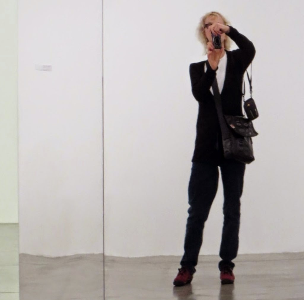
Taking a photo in the mirror intallation.


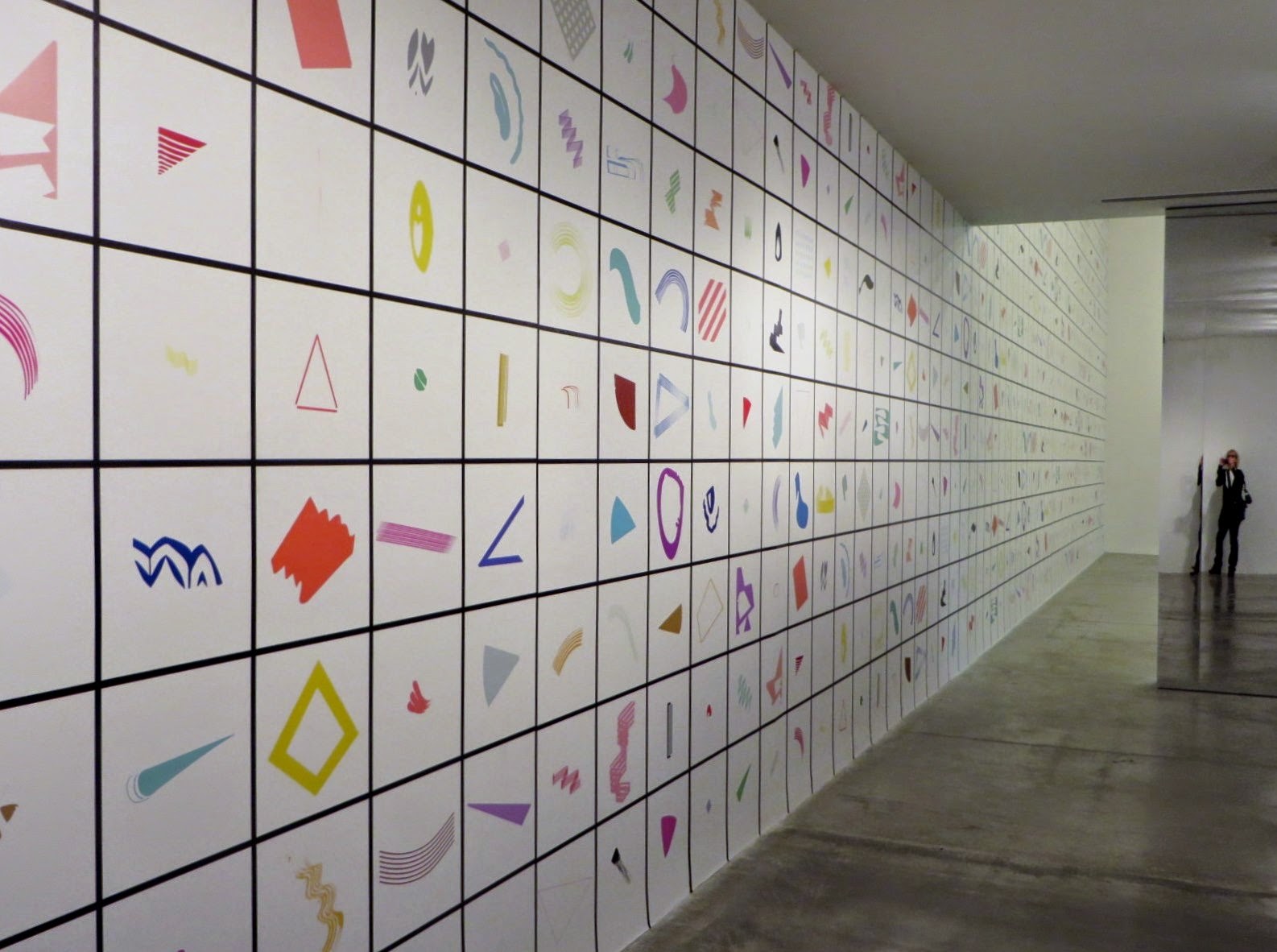
 In addition to the mirror installation, a visual catalogue of  artist's marks  covers the long sidewall of the gallery,  systematizing her " established, strong and personal vocabulary"as Jason, one of the staff described it.
   
Enthusiastic, unpretentious,and helpful, the three Powerplant staff are  generous with  insight and expertise. It was very helpful to discuss  the exhibition with Jason who came into the gallery. We agreed that Julia Dault's  paintings are beautiful.

  Dault has also included three sculptures "made on sight to a predetermined palette".